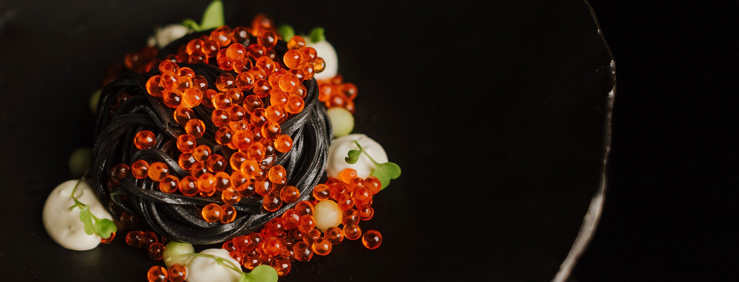
Every image you publish as part of your brand messaging is a visual link between you and your customer. Being in a responsive frame of mind when sourcing or creating photos for your website, online app, or digital marketing is key. Why? We all know websites come to life with great photography — although it isn’t quite as simple as it used to be. Gone are the days when a website was designed for the desktop user only. Over the years we have seen an overhaul in the way digital media is served up, so we’ve compiled some valuable tips below to keep in mind for your next photo shoot.
1. Be aware of your surroundings.
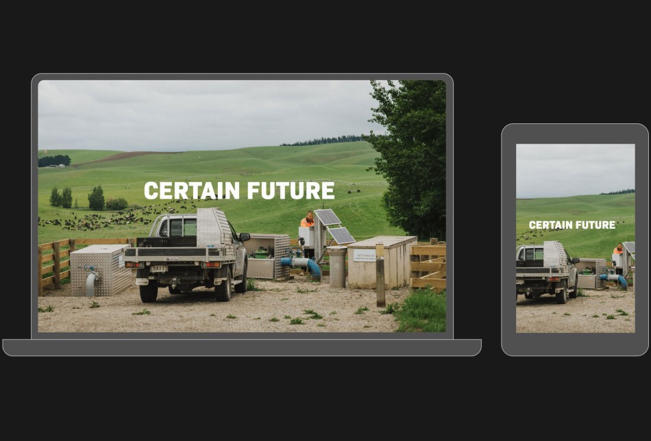
Responsive shooting means being aware of your surroundings. Images that sit in a full-width hero banner, or a parallax section will need to be versatile. On a desktop screen, the image might be a 16:9 ratio (landscape format), however on mobile it might be a 9:16 ratio (vertical format). The main subject within your image will need to be centred with plenty of margin so it doesn’t get lost when switching between views, or be coded in a way that an alternative image is served up when viewed on a mobile device. A simple way of achieving this is to shoot wider or further back than you think you'll need.
2. Respect the contrast.
What we mean here is to be aware of any pre-existing brand or design styles. One of the biggest culprits here is text, or more specifically the contrast between text colour and image background. This occurs often in hero banners where a message is displayed over an image. A well-written heading or piece of copy can disappear all too soon the moment white text is introduced over a light sky background. We often use contrast checks to ensure our websites meet WCAG standards using tools like Colour Contrast and the same rules apply for images. With a little planning or smart use of subtle overlays, your images and text will work in harmony.
3. Be aware of others.
Shooting responsively means being aware of other elements in the design. Again with the unassuming text block above, but this time with the positioning and composition of the text in relation to the main subject of the image. An image will lose its impact when a heading is laid across it recklessly. However, your design comes to life with negative space allowed within the image, and your text has a natural home to be placed.
We’re seekers of harmonious design and content, and happy to help you achieve the same. See some examples on our portfolio, or reach out to us for a chat.

 Back to all articles